Wednesday

CSS Tooltips

What is a tooltip? Essentially, it's a bit of text that when you hover over it (or sometimes click on it), additional information about that text is provided to you. Something like this:


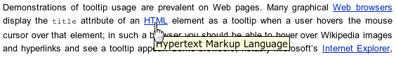
HTML natively supports these with elements such as abbr, which will show the contents of the title attribute on hover; in this case, abbr is semantically meant to be used for abbreviations, like "Prof" for "Professor". Similarly, the acronym tag is meant for acronyms, like NASA. But, they both do the same thing, using the title attribute on hover. In fact, you can pretty much do this with any element; for example, you could add a title attribute on a div if you wanted, and on hover over that div, the browser will reveal your title's text. You can even style these if you wanted, such as defining "cursor: help", which will show a question mark on hover. I've added a couple of these as examples in my demo.


You could alternatively use a span for your tooltip, and by just including your hover content in the title attribute, it will behave similarly to the above examples. To style these, you'd just use "span[title]" as your selector, so you only style spans that have a title attribute in a tooltip like way. That being said, semantics would suggest that a span isn't really appropriate. Enter the CSS tooltip.


CSS Tooltips

The HTML

Your opinion may differ here, but to me a tooltip is very much like an anchor that has no destination (or maybe you have some that do, which we will also talk about later). So, I use the anchor tag here with a class of tooltip. Something like so:

Full tooltipHere is the text description for the tooltip.
You'll also see that I've added a span in there that contains the descriptive text I want to reveal on hover. This is the entirety of the HTML needed here. You'll notice that I'm not defining an href here, this is on purpose, because in my case this won't actually link to anything (more on this later).


The CSS

Here we go:

.tooltip {
    position: relative;
}

.tooltip span {
    display: none;
}

.tooltip span,
.tooltip span:hover {
    color: #fff;
    cursor: default;
}

.tooltip:hover span {
    display: block; 
    position: absolute; 
    top: 1.7em; 
    left: 0;
    width: 150px;
    padding: 3px;
    background: rgba(0,0,0,.85);
    border: 2px solid #000;
    border-radius: 5px;
    box-shadow: 2px 2px 5px #333;
    z-index: 9;
}

.tooltip span:before {
    content: "";
    height: 0;
    width: 0;
    border-bottom: 7px solid #000;
    border-right: 7px solid transparent;
    border-left: 7px solid transparent;    
    position: absolute;
    top: -9px;
    left: 3px;
}

a.tooltip[href]:hover {
    cursor: pointer;
}


Let's break this down...


  1. First, I want to set a position context on my .tooltip class so that I can position my span absolutely relative to the tooltip. I do that by setting "position: relative".
  2. Next, I want the default behavior for that span to be "display: none" so it doesn't show up until we want it to.
  3. The real action of this is using ".tooltip:hover span" and setting "display: block". This will reveal the contents of my span on hover over the tooltip. Of course, without some absolute positioning, it will just run inline next to our tooltip, which isn't what we want.
  4. Now we can start styling our span...I'm offsetting it to the bottom of the tooltip, giving it a semi-transparent background using RGBA (note RGBA browser support), adding a border and rounding the corners a bit, and adding a box-shadow
  5. Finally, I wanted to add a little arrow pointing to the tooltip as a nice touch; I accomplished this with a CSS Arrow (which I wrote a tutorial on), and positioning it absolutely just outside my span. Adding z-index finishes things off so we have the right layering...
Presto!


Full Demo With Code


Additional Stuff

I mentioned earlier that you could also use this in other ways, e.g. for an anchor for which you want to include an href. I've included a simple example of this in my demo, the only variant I chose was that anchors that have an href are underlined, indicating they are clickable (I also changed the cursor to a pointer indicating clickable); You can style these however you want. In fact, using attribute selection, you could add a nice little icon next to (probably after) your link as further indication to the user what kind of interaction they can expect. Taking that just a step further, you can use attribute/value selection to target anchors that define the link to be opened in a new window (i.e. target="_blank"), or select anchors that contain the string "http" to indicate an external link (instead of a relative link to your own site, e.g. /foo.html). Anyhow - lots of fun to be had here. Enjoy!

Thursday

CSS Zebra Striping

We used to do this with either javascript (by adding and removing class names to our table rows), or with html (by adding class names to alternating rows), but CSS3 now let's us do this really easily. Here's my example:

The Code

It's pretty straight forward actually; our table here is totally typical with no added classes or markup than you would normally include. The zebra striping here comes from utilizing the following:

tr:nth-of-type(even) td {
    background: #eee;
}

What this does is for every even table row, add a light gray background to all of it's table data cells. You could easily alternate by odd rows as well:

tr:nth-of-type(odd) td {
    background: #eee;
}

There's lots of other things you can do too, like stripe every 3rd row:

tr:nth-of-type(3n) td {
    background: #eee;
}

Or stripe every 3rd row, but include the first row:

tr:nth-of-type(3n+1) td {
    background: #eee;
}

Here, I opted for the standard even row alternating zebra striping, but also added a hover just because I like that effect:

tr:hover td {
    background: #08d;            
}
Anyhow, that's all there is to it.

Full Demo with Code

Browser Support

As with most juicy CSS3 stuff, IE8 and older doesn't handle this feature (specifically the "nth" type selectors). If you really must support zebra striping for these users, you'll have to fall back to the old school way of doing so, but given the additional work involved in that for such little benefit, it seems a better idea to let those users experience your otherwise perfect table.

Wednesday

Different list item bullet and text colors

What if you have a bulleted list where you want the bullet color to be different than your text color? There's no property in the list-style that allows for this, unless you want to use images for your bullets, so instead we'll just add a span within our list items, and style the list and the list spans with different colors.


The Code

In this example, I'm adding 4 list items, the first 2 without the span, and the last 2 with so we can see the difference:

My list items with a span will look like so:

  • This one does have a span in it
  • And then, we add our CSS, selecting our spans and defining a different color than for our ul:
    ul {
        margin: 50px; 
        list-style: inside; 
        color: red;
    }
    
    ul span {
        color: black;
    }​
    
    Presto.

    Full Demo with Code

    Monday

    CSS Arrows Explained

    Overview

    CSS arrows are pretty cool and have been around a little while now. I've used them in a couple of small projects and while they save me from cutting new images for arrows, the biggest benefit I think is that they allow for super fast changes in size, color, etc, without having to re-cut new images with every design iteration. That being said, I initially found it a bit difficult to grasp HOW they worked. So, here we are...

    The basics

    First, you need an HTML element to attach your styles to. I generally think of arrows as being almost always an inline element (i.e. flows right next to (inline with) other text), as in a toggle link to show/hide content on the page or sort links, etc. As such, I like the span tag:


    I'll set a class of "arrow" on my span to use as the base setup stuff, and in this case a "right" class that I'll use to define my right arrow styling. Later on I will add classes for each arrow direction (up, down, left, right); another naming approach would be to use compass classes too if you like that (e.g. arrow-NE, arrow-S, etc).

    Base CSS

    I'm adding a margin to my .arrow class just to add some breathing room between my arrows in this example, but this part is not necessary for our arrows. The first thing I need to do is define my span size to 0. This is because we will be using BORDERS to define our arrows, and in order to keep a nice point, we need a 0x0 pixel box. Because inline elements don't have dimension like a block element does, we'll need to set our display to inline-block. As an alternative, you could use display: block, but then you would have to deal with floats and overflows and such. This allows us to define dimension on our span, but still keep it drawn inline. Of course, inline-block isn't well supported by IE7, so to help with that (or not, up to you), we could add *display: inline, and zoom: 1, which will allow IE7 to behave how we want:

    .arrow {
        margin: 5px;
        height: 0;
        width: 0;    
        display: inline-block;
        /* IE7 inline-block hack */
        *display: inline;
        zoom: 1;
    }     
    

    Adding the Arrows

    Okay, now we get to the meat of things. As I mentioned earlier, we are going to be using borders to work our magic. Most often we add a single color border to our elements, so whatever border-width we have defined, the borders are drawn as a nice thick (or thin) solid border around our box. But, what happens when we define different colors for different sides of our box? Well, something like this happens:

    Basically, the browser miters the corners together. All of a sudden, we start seeing the arrow shape we want, so from here it's really about defining just ONE of these arrows by using borders on only 3 sides of our box, and using a combination of color and transparency.

    Now let's apply this to our "right" class. Looking again above at our grayscale box with the 4 inward pointing arrows, we want to mimic the lightest gray arrow. This is achieved by defining a colored left border, and transparent top and bottom borders. The top and bottom transparent borders are working exactly as our above example's top (black) and bottom (#666 gray) borders/arrows. In my case, I wanted to use orange and have a 25px tall arrow:

    .right {
        border-left: 25px solid orange;
        border-top: 25px solid transparent;
        border-bottom: 25px solid transparent;    
    }
    

    Putting it all together

    Now we can build out our arrow variants. I'll start with adding several example spans with classes for each direction I want to represent:


    And then add in my arrow styles:
    .right {
        border-left: 25px solid orange;
        border-top: 25px solid transparent;
        border-bottom: 25px solid transparent;    
    }
    .left {
        border-right: 25px solid orange;
        border-top: 25px solid transparent;
        border-bottom: 25px solid transparent;    
    }
    .down {
        border-top: 25px solid orange;
        border-left: 25px solid transparent;
        border-right: 25px solid transparent;    
    }
    .up {
        border-bottom: 25px solid orange;
        border-left: 25px solid transparent;
        border-right: 25px solid transparent;    
    }
    .up-left {
        border-top: 25px solid red;    
        border-right: 25px solid transparent; 
    }
    .up-right {
        border-top: 25px solid red;    
        border-left: 25px solid transparent; 
    }
    .down-left {
        border-bottom: 25px solid red;        
        border-right: 25px solid transparent;
    }
    .down-right {
        border-bottom: 25px solid red;        
        border-left: 25px solid transparent;
    }
    ​And presto - now we have nicely defined classes for each of our arrows:
    

    Full Demo With Code

    Additional Stuff

    You could add a border radius if you wanted, but it would only effect the outside border edges; i.e. the "point" of the arrow will still be pointed. Still, it's a nice effect to lightly soften the outside points.

    You could also add arrow tails by using :before on your arrow classes, adding content: "", giving it some dimension and color and position relative to your .arrow class (which you'd add a position: relative to set positioning context), etc...Additionally for the angled arrows (e.g. up-left, down-right), you could use CSS rotation with a 45deg (or -45deg) angles.

    Finally, you could consider adding some animated rotation to your arrow direction. For example, you may have a right pointed arrow indicating an openable drawer of content, and onClick, you could add/remove your direction class to point the arrow down and animate between them. I haven't played with this yet, but it could be pretty sweet. Hooray CSS!

    Tuesday

    CSS Flag Banners


    I'm not sure if that's what these things are called, but that's what I'm calling this thing:

    Whatever we call it, I did it using only CSS, and thought I'd show how I did so.

    Code

    Really, it's pretty straight forward; I'm using the :before selector to my element (in this case .date-outer), to add some blank content. I need it to have dimension, so I'll add display: block, and because I want a height of 40px, I'll add that, with a width of 0 (more on that in a minute):

    .date-outer:before {
     content: "";
     display: block;
     height: 40px;
     width: 0;
    }
    

    I'm going to absolutely position this thing, but because I need to set the position context to the .date-outer element, I'll add position: relative to it:

    .date-outer {
     position: relative;
    }
    

    And then define my position for my flag thingy with a top offset of 0 (it will snap to the top of .date-outer), and a negative left offset so it'll hang off the left side (my -17px left offset places the flag hanging sort of half way off the left of my element):

    .date-outer:before {
     content: "";
     display: block;
     height: 40px;
     width: 0;
     position: absolute;
     top: 0;
     left: -17px;
    }
    

    Now, I'll define my flag with borders. First I'll add a left border of black, and a right border of red, both of 15px. This would just make a 2 color rectangle on it's own, but by adding a transparent border-bottom of 15px as well, I get a nice upward facing transparent arrow notched out of the bottom of my rectangle. Then, I just added a border radius to round out the top-left of the flag, and presto:

    .date-outer {
     position: relative;
    }
    .date-outer:before {
     content: "";
     display: block;
     height: 40px;
     width: 0;
     position: absolute;
     top: 0;
     left: -17px;
     border-top-left-radius: 15px;
     border-left: 15px solid #000;
     border-right: 15px solid red;
     border-bottom: 15px solid transparent;
    }
    

    A tiny step further

    For fun, I wanted to alter the color of my flag for each of 3 posts on the main page. I accomplish this by utilizing nth-of-type, and for my 2nd and 3rd :before styles, I'll define my left border color as a dark gray and a lighter gray (respectively):

    .date-outer:nth-of-type(2):before {
     border-left-color: #666;
    }
    .date-outer:nth-of-type(3):before {
     border-left-color: #999;
    }
    

    Support

    This latter bit isn't supported by IE8 and older, but otherwise it's pretty safe to use.

    Monday

    Lists cannot be children of Paragraphs

    Yes, truly. I admit I was a little surprised at learning this, but according to the W3 HTML spec for the p element:

    List elements (in particular, ol and ul elements) cannot be children of p elements.
    Reading a bit further, paragraphs are intended for phrasing content:
    Phrasing content is the text of the document, as well as elements that mark up that text at the intra-paragraph level.
    Also,
    Most elements that are categorized as phrasing content can only contain elements that are themselves categorized as phrasing content, not any flow content.
    Whereas, lists (e.g. ul, ol) are defined as flow content.

    Impact

    What happens when you have a list as a child of a paragraph? It turns out that the browser will actually close your p tag when it tries to render your list. It does this at the start of your list. In my example, I show a paragraph with a ul inside it, and attempt to select the ul to color it blue. But it doesn't work due to the above (per the specification, properly rendered) behavior.

    DEMO WITH CODE

    Learn something new every day. :-)

    Sunday

    Twitter Bootstrap Nested Nav Lists

    Overview

    I finally was able to begin using Twitter Bootstrap in a recent project for which I am recreating a complex navigation into the new Bootstrap interface. But, I found that while I needed to support nested nav lists within the top level nav list, Bootstrap doesn't seem to have any built in support for it: Bootstrap Navbar.

    So, I built support for it; and here's what I came up with:
    (screenshot)


    The Code

    I wanted to preserve Bootstrap's naming convention and HTML structure, so I didn't want to do anything really very new. I also wanted to retain their common styling, but come up with something that worked for sub navigation. So, I started with adding my HTML
    (forgive the html styling here, the tool I'm using doesn't prettify very well):

    So, basically I just repeated their existing convention, and added a "nav nav-list" classed li, with a dropdown-menu ul under it.

    Next, I needed to start styling; using their common style, I enhanced the nexted nav functionality by adding :hover state show/hide of the sub menu list.

    .nav li.dropdown ul.dropdown-menu li:hover ul {
        display:block;
        position:absolute;
        left:100%;
        -webkit-border-radius: 3px;
        -moz-border-radius: 3px;
        border-radius: 3px;
    }
    
    .nav li.dropdown ul.dropdown-menu ul {
        display: none;
        float:right;
        position: relative;
        top: auto;
        margin-top: -27px;
    }
    
    Bootstrap on it's own adds carets (the arrows) for dropdown menus, and sort of assumes the sub-nav will always be below your menu item. So the menu item's caret/arrow always pointed down, and the sub-nav's menu arrow always pointed up; I needed to address this:
    .nav li.dropdown ul.dropdown-menu .nav-list .caret {
        border-bottom-color: #999;
        border-top-color: #999;
        float: right;
    }
    
    .nav li.dropdown ul.dropdown-menu .nav-list:hover .caret {
        margin-left: 6px;
        margin-top: 5px;
        margin-right: 1px;
        border-right: 0;
        border-left: 4px solid #fff;
        border-top: 4px solid transparent;
        border-bottom: 4px solid transparent;
    }
    
    .nav li.dropdown ul .nav-list .dropdown-menu:after {
        top: 8px;
        left: -12px;
        border-top: 6px solid transparent;
        border-bottom: 6px solid transparent;
        border-right: 6px solid #fff;
    }
    
    .nav li.dropdown ul .nav-list .dropdown-menu:before {
        left: -7px;
        border-left: 0;
        top: 7px;
        border-top: 7px solid transparent;
        border-bottom: 7px solid transparent;
        border-right: 7px solid rgba(0,0,0,0.05);
    }​
    
    Here things began to get a little tricky; specifically, Bootstrap uses CSS borders to draw their carets/arrows (which I think is a great approach by the way); this is fine, but because I'm inheriting their styles on my new nav element, I needed to reverse the borders I didn't want so I could adjust the direction of my caret/arrow to the right and left (for the sub nav); then I could add the styles I did need, with colors appropriate for my nesting.

    Finally, I added in some common list item over styling:

    .nav li.dropdown ul.dropdown-menu li.nav-list:hover {
        background: #08c;
        color: #fff;
        cursor: pointer;    
    }
    
    .nav li.dropdown ul.dropdown-menu .nav-list {
        font-size: 13px;
        color: #333;
        float: none;
        line-height: 21px;
    }
    

    FULL DEMO WITH CODE

    Add here you have the finished product...we now have a dropdown menu list, with sub-nav elements, indicated by custom carets, when hovered reveal their own dropdown lists (though dropped to the right), with left arrows instead of up arrows, and all commonly styled ala Bootstrap. Boo yah!

    Friday

    CSS Only Accordion Menu

    A project on my radar is to add accordion functionality to some existing elements on the page. The tried and true method is to use javascript for this (e.g. jQuery's Accordion), and in fact I may very well end up using .js for my project. But, I got to thinking that maybe I could use the CSS3 :target pseudo-class, and skip javascript altogether.

    HTML

    The markup is really pretty semantic and straight forward. Your markup may differ of course, but I'm thinking of this as a list of 3 Groups of content that I want to accordion navigate between. I'll call each of my list items a class of "top-level", each of which must have a unique ID that will serve as our target anchor; because CSS doesn't much like numeric classes or IDs (it's supported, but you have to escape them), I'm going to be careful to define each of my IDs as "group-n", where n is the unique Group number. Within each of my list items, I need an anchor where the href is a hash followed by the ID of the anchor's top-level Group ID. Then, I'll create whatever content I want to show/hide with the accordion action, and just call each of these a class of "sub-level". So, my markup is going to look a little something like so (forgive the code formatting):

    • Group 1

    • Group 2

      Lorem ipsum dolor sit amet, consectetur adipiscing elit. Nullam nec dolor non lacus pharetra dapibus eu at tortor. Sed dictum blandit metus a rhoncus. Vestibulum consectetur fringilla velit eu aliquam. Etiam sodales libero velit. Morbi hendrerit, risus vel faucibus elementum, justo augue scelerisque magna, nec posuere velit nisl at nisl. Donec auctor venenatis nulla quis lacinia. Nullam id blandit nibh.


    • Group 3

      Lorem ipsum dolor sit amet, consectetur adipiscing elit. Nullam nec dolor non lacus pharetra dapibus eu at tortor. Sed dictum blandit metus a rhoncus. Vestibulum consectetur fringilla velit eu aliquam. Etiam sodales libero velit. Morbi hendrerit, risus vel faucibus elementum, justo augue scelerisque magna, nec posuere velit nisl at nisl. Donec auctor venenatis nulla quis lacinia. Nullam id blandit nibh.

    You'll notice that I chose another list, and a couple of paragraphs as my sub-level content; this is because we can put just about anything we want here.

    CSS

    So now let's look at how to make this work. It turns out to be super easy:
    .accordion .sub-level {
        height: 0;
        overflow: hidden;
    }
    
    .accordion li:target .sub-level {
        height: auto;
    }
    
    That's it. With just the above CSS, and our nice semantic HTML, we can have an accordion menu in almost all browsers (sans IE8 and older - see below). So what's going on here? Well, really all we're doing is telling CSS to make our sub-level a height of 0px, and hide it (overflow: hidden) until later when we hit our li:target, we will change our sub-level to height: auto, to expand to show our content. DONE!

    Making it pretty

    From here you can start using your imagination, including adding some sweet, sweet, animated CSS easing of the height of as you navigate through your accordion's content. NOTE: For your height animations to work, you need an actual height value for your sub-levels; I'm not sure how to get around this just yet.

    In my demo's case, I've just added some quick styles to help make it a bit more obvious what's happening, as well as showing the addition of arrows through CSS content, which is I think a pretty nice usability addition to an accordion menu. The rest is up to you!

    DEMO


    Full Demo w/Code

    Support

    The reason I think I may end up using javascript after all is because this is a CSS3 feature, and so isn't supported in many of the browsers that are used in referencing my site. Primarily, it's and IE issue (surprise!), as IE8 and older will not support this feature. Still, I'll try and make the case that the  overhead just to support IE8 and older isn't worth it, and those users can continue seeing the old, non-accordion version...

    Thursday

    Animated text depth with gradient text-shadow on hover

    For fun, I thought I'd add some light pizazz to the page title (i.e. "Behind my Monitors") when a user hovers over the text. Go ahead and hover over that text and (hopefully!) you'll see what I'm talking about.

    This is really pretty straight forward:
    h1 {
       position: relative;
       top: 0;
       left: 0;
       -webkit-transition: all .25s ease-in-out;
       -moz-transition: all .25s ease-in-out;
       -o-transition: all .25s ease-in-out;
       -ms-transition: all .25s ease-in-out;
    }
    
    h1:hover {
       text-shadow: -1px 1px 0 #000, -2px 2px 0 #333, -3px 3px 0 #666, -4px 4px 0 #999, -5px 5px 2px red;
       top: -5px;
       left: 5px;
       -webkit-transition: all .25s ease-in-out;
       -moz-transition: all .25s ease-in-out;
       -o-transition: all .25s ease-in-out;
       -ms-transition: all .25s ease-in-out;
       color: #fff;
    }
    
    1. I first set relative positioning to my h1, because I'll be animating a position offset, and set the top and left values to 0.
    2. I then add a :hover state and add some comma separated text shadows. I've added 5 different colored shadows, with no spread (so they're sharp), and offset them by 1px at each step. This creates the effect of a 5px multi-colored gradient text shadow.
    3. Then I added the animation to both the h1 and h1:hover.
    And that's it. It's a bit cheesy; not unlike old school blink tags and marquees, but it also is an example of something that could be useful in the right context. Have fun!

    Escaping numeric classnames

    Though not something I tend to use often, occasionally I've had to wrangle classnames that either were totally numeric, or just started with a number (e.g. "4star" for a hotel rating). Numeric classnames are valid, however selecting them in your CSS requires character escaping. For example, to style this span:
    Some Average 4 Star Hotel
    
    I would need to escape the number "4" with a "\3", like so:
    .\34star {color:red};
    
    I read somewhere that (oddly) IE doesn't mind numeric classes, but I've found that unless I escape my selector with "\3", the various browsers won't select my element.

    NOTE

    IDs can't start with a number; classes can, but IDs cannot - they won't work.

    Saturday

    Adding CSS marquee to HTML marquee

    Let me begin by saying that I don't even like this feature, as I can't think of many nice uses for it, but I wanted to play around with the new CSS feature anyway.

    HTML Marquee Element

    You've seen this thing in the way back machine, it's really just moving the text within the marquee tag across the page. Wheeee! But, it's annoying, so it's rarely used - in fact, it was deprecated, but is now actually back in the form of a CSS3 spec (though not yet finalized, so browser implementations still vary/don't exist).

    So, now we have both marquee (the HTML element), and -webkit-marquee- (the CSS version for Webkit)...They're both supported by webkit, so what happens if we apply BOTH?

    As it turns out, it sort of just works. Adding overflow-x: -webkit-marquee; will make apparently any element behave like HTML marquee does. Additionally, even if you apply it to the HTML marquee, -webkit-marquee-direction: forwards; will change the scroll direction.

    DEMO

    The red text is the plain HTML marquee, the blue text is the CSS marquee running on another HTML marquee, and the green text is a paragraph with the CSS marquee. The second set of these are just within a div of class "forwards" to which I add the the direction. NOTE: You need to view this in either Chrome or Safari (Browser Support)...

    Full Demo w/ Code

    Friday

    Double classes, double attributes

    What happens if you have an HTML element that has TWO class attributes? For example, consider the following:

    <div class="red" class="uppercase">Hello World!</div>
    
    And let's define a couple styles:
    .red {color: red;}
    .uppercase {text-transform: uppercase;}
    
    It turns out that only the FIRST class definition is respected by the browser; i.e. our example will be red, but NOT uppercase.

    Testing

    Using an online based tool (Litmus), I was quickly able to render my test page and verify this behavior in 11 browser versions, including IE6-9, FF 12, Chrome 18, Opera 11, Safari 5, and iPhone 4s. Below is a screenshot so you can (sort of) see.

    Double Attributes

    As a semi-related question, I thought it would be interesting to try targeting attributes instead of classes, so I tried this:

    <div red uppercase>Hello World!</div>
    
    And then changed my css to use (CSS2) attribute selectors:
    .red, div[red] {color: red;}
    .uppercase, div[uppercase] {text-transform: uppercase;}
    
    And presto, my "Hello World!" becomes both red and uppercase. Interesting. Note that for this to be valid (only in HTML5 I believe), you'd want to add "data-" in front of each attribute, e.g. "data-red"; more info here: HTML5 Custom Attributes

    Full demo with code

    A different line-through color

    Ever tried styling a line-through price so the strike color is different than the text? You know when you're looking at a sale online and the thing you're looking at is something like 20% off, and the merchant shows you a "before" price that has a horizontal line through it? This can be achieved in CSS using the line-through value on the text-decoration property. By default, it puts a line-through your text which is the same color as the font in that element. But what if you wanted a different color for the line than you have for the text (e.g. a red line through black text)? Turns out you can't style that separately in CSS; i.e. there's no support for something like line-through-color...But interestingly enough, you can add a bit of HTML structure around your text (price in our example), and this structure will allow you to style things uniquely. To wit:

    Example HTML

    
        $515.00


    Example CSS

    .strikethrough {
        text-decoration: line-through;
        color: red;
    }
    
    .strikethrough * {
        color: #000;
    }
    

    Rendered Example

    Buggy Behavior?

    Pretty sweet. I wonder why it works this way though, because we are adding text-decoration to a container that doesn't actually have any text in it. Sure it's child has text, and we know that rules will be inherited by their children, but the line-through is working on the child DESPITE the child's inheritance of line-through. That is, the parent line-through is working on it's child's text, while the child's text is NOT actually applying a line-through at all. In fact, I can show this by setting my child to text-decoration: none, and yet the line-through still works on the parent. I find this odd, but oddly satisfying. This behavior is very nearly a bug in my opinion, though it's also a nice (maybe unintentional) feature. This goes way back to CSS1, so I think we're good. Here's some of my additional testing to see if this behaved differently with block or inline element combinations...turns out the answer is no. :-)

    Support

    Seems pretty good - I'm seeing very little support information for this feature on any of the usual boards (e.g. caniuse, quirksmode, sitepoint), but I've tested in FF, Chrome, IE7+, and all work similarly, and as expected. Mozilla claims support back to IE3 (IE3!), so it seems this is pretty ubiquitous in terms of support.

    Wednesday

    Generating quotes with CSS

    You may have been made familiar with CSS generated content by reading blogs such as this one: Automatically Numbering Non-Lists...Or maybe not, whatever the case, there's other content generation we can do with CSS, like adding quotes.

    I usually would just add a blockquote to my markup and add CSS generated content :before and :after my blockquote, like so:

    blockquote:before {
        content: "“"; 
    }
    blockquote:after {
        content: "”";
    }
    
    And this works just fine; in fact, I might even argue that despite this blog post, this blockquote content approach may very well be the better approach. But, we're going to look at something new anyways; The CSS Quotes property.

    Essentially, all this thing does is allow you to define your entire hierarchy of nested quotes to use throughout your site, and then call them in a nice, easy way. It's pretty straight forward, simply select your blockquote (and in my case, I'm also going to select the q element), and define your hierarchical quotes in left/right order:

    blockquote, q {
        quotes: "1" "1b" "2" "2b" "3" "3b";
    }
    
    In my example, for the sake of illustration, I'm going to use a numbering system 1, 1b (1 for left and 1b right quotes), and continue that through to a 3rd level. I'm also going to add some styling to call out the 3 levels of quotes that I'm going to have in my HTML:
    This is a super important quote. Here is a sub quote within my big quote. And now some lorem ipsum...
    Now for my expanded CSS; you can see that to reference my quotes as defined, I'm going to use the :before and :after classes, and add my content, but instead of adding a string of "1", I can just say open-quote (and close-quote for the :after). This is possible because I've defined my quote content hierarchy in my quotes property:
    blockquote {
    font-family: sans-serif;
        margin: 1em;
    }
    
    blockquote, q {
        quotes: "1" "1b" "2" "2b" "3" "3b";
    }
    
    q {
        background: #fcc;
        padding: 3px;
        border-radius: 3px;
    }
    
    blockquote:before,
    blockquote:after {
        content: open-quote;
        font-size: 2em;
        font-weight: bold;
        color: orange;
    }
    
    q:before,
    q:after {
        content: open-quote;
        font-weight: bold;
        color: blue;
    }
    
    blockquote:after,
    q:after {
        content: close-quote;
    }
    
    q q:before,
    q q:after {
        font-weight: normal;
        color: green;
    }
    
    The end result will look like so:

    I added a pink background around my inner q element to illustrate that our added quotes actually are included INSIDE our elements. Anyhow, sort of neat. Below is the full code...

    Full Demo with Code

    Final Thoughts

    You could include the cite element in this discussion, and there are obviously a myriad of ways to render this stuff, so I'll leave it to you how you want to do that - but I think Smashing Magazine has a nice write up to take it from here.

    Tuesday

    Automatically Numbering Non-Lists

    CSS allows us to add incremented number counts to repeated items on a page. Very similar to an ordered list, where by simply using appropriate HTML markup (e.g. Ordered List Example), you'd sort of magically get your list items numbered in order from 1 to N. But, what if you want to number things that AREN'T a list. Well, step one might be to make those things into an ordered list, but sometimes you don't have that level of control, or semantics suggest something different.

    As an example, perhaps you have yourself a site that has a group of articles (which is a new element in HTML5 - Note that articles aren't necessarily like a news article, but rather more like an article of clothing - that is, it is something stands uniquely on its own.); and let's say you want to number your articles in the order in which they appear on the page. Instead of manually adding something like "Article 1", "Article 2", and so on, you could instead just use CSS to help you out.

    Essentially, what we can do is select the elements we want to number (in our case, just all "article" elements), and utilize the counter-increment property to define a CSS variable that will contain a number that will increment for each of elements of our selection that is found. Then, we just need to use that variable by utilizing the content property, and include our counter variable. Our CSS will look like this:

    article { 
        counter-increment: articleCount;
    }
    article:before {
        content: "Article " counter(articleCount);
    }
    
    Basically, I have named our article counter-increment variable "articleCount", and then using the :before selector, adding my content. I'm first adding the string "Article " (note the space in there), and then add the counter, with my articleCount variable. Presto.

    Notice that I'm also defining two unique sections, within which I have my articles grouped. I then added a similar, but separate sectionCount, so I could illustrate how the counter-increment is unique by parent node. That being said, you could opt to use the counter-reset property. You can also chain your counts together:

    Full Demo with Code

    Full Demo with Code (chained variables)

    Usage

    It's important to note that IE6/7 don't support this functionality; see here. Though, SitePoint also suggests buggy support in Opera, so something to look out for.

    Wrangling 3rd Party Images

    Sometimes our images are coming from a 3rd party (sometimes further away) content source, and so can be a challenge to render on our page in a common way among differently sized images coming from elsewhere. Let's say we want to normalize all our images to a 100px square, regardless of the source size. Using CSS, we could just resize all images into a square like this:

    img {
        height: 100px;
        width: 100px;
    }
    
    But this doesn't really work unless all our source images are also square, otherwise you'll be forcing your images into a non-native aspect ratio, and you'll be left with images that look like they are from an old spaghetti western movie (squished into being super tall and skinny). We don't want this, but we do want to keep our images as consistent as we can. So, instead of doing this, we want to just force our images to only ONE specific dimension, and leave the other to scale normally. Something like this:
    .thumbnail {
        overflow: hidden;
        width: 100px;
        height: 100px;
    }
    
    .thumbnail img {
        width: 100px;
        height: auto;
        max-height: 100px;
        -ms-interpolation-mode: bicubic;
    }
    
    Notice that I've added a "thumbnail" container around our images for clipping purposes. Our thumbnail will be the actual dimensions we want to show to the user, in this case a 100px square, and set the overflow to hidden so any image that happens to be bigger than this will not be shown, resulting in what seems to the user to be perfect 100px square images.

    Our img styling now is set to a static width of 100px, and I'm going to set height to auto, which tells the browser to scale the height to whatever is appropriate based on the static width we defined and the aspect of the original. In addition, I've added here extra instruction for old IE browsers to scale images in a very specific way - in fact, I add this to my reset stylesheet when I'm building any site. Here's some more info on this from CSS-Tricks.

    Demo

    Full demo with code

    (Note I added a yellow outline, and a white background on each thumbnail to show where the 100px square clip is.)

    You can see a few different cases here, all of which should show images that are sized down AND cropped to our defined box, while retaining their original aspect ratio; if the source is a rectangle, and if it's wider than it is tall, there's a chance it will not fill our full 100px of height. I think this is acceptable, and I've found it to be rare enough that it doesn't seem to be an issue.

    The other thing you may want to consider is adding a default "no image found" background image onto .thumbnail for when a broken img occurs - this way, your users will still see something semi-nice and consistent with the other images on the page (some browsers show a broken image icon, others do not).

    Placeholder images here are from lorempixel.com

    Note: If you'd like to vertically position your images (e.g. in the 2nd case here, you could middle align your image instead of the default top alignment), you can do so by setting "vertical-align: middle" on your img, and "line-height: 100px" to .thumbnail.

    Monday

    CSS generated content issue on Chrome/Safari

    Recently I needed to use CSS content to help with some display stuff. Skipping through the typical debate about separation of concerns, I had to use this method because in this case I don't have access to the actual markup of this part of the page. This really does happen to web developers on occasion, typically due to 3rd party generated content, which was the case here.

    Basically, all I needed to do was add a text "header" before my content. So, I added something like the following;

    p:before {
        content: "Header Text";
        display: block;
    }
    
    Note I wanted to add "display: block" here to introduce a line break between my new CSS generated content and the pre-existing text of my paragraph. No big deal, because I know that this is a supported feature with just about every browser sans the usual IE6/7, which I'm comfortable with leaving alone without the added content: http://www.caniuse.com/#feat=css-gencontent.

    My particular case of 3rd party content was a bit more troublesome than usual, because it's made up of a bunch of unclassed paragraph tags, with bold tags representing what the 3rd party thought would be like a sub-header for each paragraph. The paragraph I need to edit was the 5th in this structure. This block of HTML looked something like this:

    Sub header 1 A bunch of content

    Sub header 2 A bunch of content

    Sub header 3 A bunch of content

    Sub header 4 A bunch of content

    Sub header 5 A bunch of content

    Sub header 6 A bunch of content

    My thinking was that I wanted my generated content to be within my 5th paragraph, but before the bold tagged "sub-header"; as such, I change my selection to something a bit more complicated. So, I updated my CSS selector:

    .some-content p:nth-of-type(5) b:before {
        content: "Header Text";
        display: block;
    }
    
    And it works as expected in recent versions of Firefox (though CSS3 selection isn't supported in IE8, so there's an issue there now), but yay! But this did not work as expected in either Chrome or Safari. What the heck?

    Resolution

    As it turns out (for reasons currently unknown to me), both Chrome and Safari didn't like adding the :before pseudo-class onto the b tag. Changing the selector to remove the bold, things worked:
    .some-content p:nth-of-type(5):before {
        content: "Header Text";
        display: block;
    }
    
    I've always tried to avoid this type of combined selector with 2 pseudos, in this case "p:nth-of-type(5):before" would seem to elicit some buggy behavior. Only I've been shown I was a bit wrong, at least in this case. The above is working for Chrome 18, Safari 5, Firefox 11, IE 9 (sort of buggy re: positioning). IE8 and older are sort of out of the picture here now due to my fancy selector; I'm OK with this.

    Thursday

    The difference between the CSS selectors a:hover.className and a.className:hover

    a.foo:hover and a:hover.foo are treated identically in modern browsers. I've tested back to IE6, and it works as expected. That being said, my personal preference is to define the selector first and then apply the psuedo-class; e.g. a.foo:hover. I just feel it reads more intuitively.

    This was a question asked on Quora that I thought would be a nice additional reading here...One of the "huh" moments for me, so I figured I'd re-share. :-)

    Wednesday

    Nested List Styling

    Oddly enough, I had a hard time finding a good set of default list styles that would work in a myriad of cases. For example, what if I had a nested ordered list, or an ordered list under an unordered list, or vice-versa? Well, here we go. I'm sure there's some weird cases I've missed, but this gets us a nice amount of flexibility and predictable behavior.

    The entirety of my css for my lists is below. Pretty concise, and covers mostly every case I've needed.

    ul {
        list-style: none;
    }
    
    ul.bullets,
    ul.bullets ul {
        list-style: disc inside;
    }
    
    ul, ol, dl {
        margin-left: 2.5em;
    }
    
    ul ul {
        margin-bottom: 0;
    }
    
    ol {
        list-style: decimal outside;
    }
    
    ol ol {
        list-style: lower-alpha outside;
    }
    
    ol ol ol {
        list-style: lower-roman outside;
    }
    ​

    Results

    See the Demo for the full code including HTML markup, but our end result will look like so:

    Saturday

    CSS Ellipsis

    Recently I've needed to utilize the text-overflow property and wanted to share some details about using it properly. First off, you should take a quick look at the spec: http://www.w3schools.com/cssref/css3_pr_text-overflow.asp. We'll focus on the ellipsis value.

    Demo text-overflow: ellipsis

    Given an element with a specific height, and overflow: hidden, you can add text-overflow: ellipsis. BUT, it won't work properly without also adding white-space: nowrap. This is because you need to define your text to not automatically break to flow within the bounds of your element, in our case a div:

    div {
        height: 16px;
        overflow: hidden;
        text-overflow: ellipsis;
        white-space: nowrap;
    }​
    

    Browser Support

    It's really good: http://www.caniuse.com/#search=text-overflow. It's basically supported in all major browsers, including IE6.

    Usage Notes

    This really only works on a single line of text. In other words, if you want to show 2 (or more) lines of text and then overflow on line 2, it won't work that way. I have yet to find a good solution to this without using JavaScript.

    Friday

    CSS to English

    Today I had a brilliant idea! But of course, as Mark Twain said:

    There is no such thing as a new idea.
    And dang it, he's right again.

    My idea was to translate CSS selectors, which are sometimes super complex, into English. In other words, take something like this:

    p:not(#foo) > input[type=radio]:checked + label:before
    
    And translate it to something like this:
    Selects any content placed before a label element that immediately follows an input element with a type attribute that equals radio and that is a checked radio button or checkbox that is a child of a p element without an id attribute that equals foo.
    It would be pretty awesome to build a tool that would do this for me...oh wait, there already is one!

    Thank you to whomever is responsible over at The Opal Group; now I can move on to the next (probably already existing) big idea.

    Monday

    CSS Only Loader Animation

    As I test out code changes in my local environment, I always run through this interstitial/waiting page that contains a loading animation. This animation is generally done via an animated .gif, or a .swf movie. Today while waiting for my app to load some backend stuff, it occurred to me that I could pretty easily replicate this same thing in pure HTML + CSS, thus making changes to color or shape super simple.

    Here's a screenshot of what I'll be replicating:

    NOTE: I'm doing this assuming Chrome browser, and so will be leaning heavily on CSS3, and the -webkit- prefix. At the end of this post, there's a link to site that does a bunch of awesome automated stuff for all this, so I'm eliminating all the complexity for the sake of this talk.
    Update: Just added some -moz- support too, though Firefox doesn't animate as nicely as Chrome.

    HTML

    First, the markup. I figure I'm looking at a div that contains 5 objects. I'm going to call this thing "loader", and each object will just be a span (because they're inline) with a class of "frame" (though I probably don't need a class on these, I wanted to add them for clarity).

    So, our HTML markup will look like this:

    CSS

    Basic Stuff

    Let's now add in some basic styling for this thing. I really don't need to do anything with my #loader container, though I certainly could add some margin offsets or whatever I want. But my frames do need some love. I'm starting by defining a light grey background:

    .frame {
        background: #999;
    }
    
    I'm going to set these to display: inline-block, because I want them still inline like spans want to be naturally, but also want them to have the dimension properties of block. I also want to set the size of these to 20px square, and add a right margin to offset them from one another:
    .frame {
        background: #999;
        display: inline-block;
        width: 20px;
        height: 20px;
        margin-right: 10px;
    }
    
    That should get us looking like so:
    Now let's make those squares into circles by simply defining a border-radius that's half as big as our width and height dimensions, and because I want to animate opacity too, I'm going to define something nice and light as a starting point:
    .frame {
        background: #999;
        display: inline-block;
        width: 20px;
        height: 20px;  
        margin-right: 10px;    
        border-radius: 10px;
        opacity: .3;
    }
    

    Animation

    Alright, now comes the really fun stuff. First, some additional reading as a point of reference: W3Schools.com: CSS3 Animations.

    I need to define a name for my animation (sort of like a javascript function; I'll call ours "loader"), a duration for my animation (in this case I want my animation to last one second), and how many times I want this thing to repeat (in our case, I want it to repeat forever):

    .frame {
        background: #999;
        display: inline-block;
        width: 20px;
        height: 20px;  
        margin-right: 10px;    
        opacity: .3;
        border-radius: 10px;
        -webkit-animation-name: loader;
        -webkit-animation-duration: 1s;
        -webkit-animation-iteration-count: infinite;
    }
    
    Nothing is going to happen yet though because we need to define what, specifically our animation is supposed to DO. Essentially, I want these circles to:
    1. Fade in/out
    2. Change color
    3. Grow slightly
    So what I really want to define is a starting point (the base style for each where each .frame starts from), a middle point (how I want each of these to look my change), and and end point that gets us back to the start again. Each of these points are referred to as "keyframes", and we must define WHERE each of these keyframes take place in our animation. I like to think of animations like cells of a movie reel, or pages in a flip book, only instead of having to define every tiny movement between each .frame, the browser (via CSS3 animation) handles that for us. We can define our keyframe positions with a percentage:
    @-webkit-keyframes loader {   
        0%   {}
        50%  {}
        100% {}
    }
    
    Now that we have our keyframes for our animation defined, we can define WHAT we want to happen at 0%, 50%, and 100% of our animation. Recalling my list of things I want to do (fade in/out, color change, size change), I'll add those in my keyframes. Note I don't need to define every property of my starting and ending points, because that's handled with our .frame styles we defined earlier. As such, I just need to define how these look in the middle of the animation, in this case opacity of 1, background-color of red, and I want to scale them up just a touch:
    @-webkit-keyframes loader {   
        0%   {  }
        50%  {  opacity: 1.0; 
                background-color:red; 
                -webkit-transform: scale(1.2); }
        100% {  }
    }
    
    Now We have a nice set of circles that all sort of pulse together from slightly transparent light grey to a full opaque and slightly larger red. But we want each of these to sort of follow each other in the animation; that is, we don't want all of them pulsing simultaneously, but rather independently, and one right after the other. I can do this using nth-child selection and a keyframe animation delay for each of my 5 .frame objects. Because my animation is 1 second long, and I have 5 objects, I'll just divide 1/5 and set each animation delay to offset by .2 seconds; that CSS will look like this:
    .frame:nth-child(1) {
        -webkit-animation-delay:0.2s;
    }
    
    .frame:nth-child(2) {
        -webkit-animation-delay:0.4s;
    }
    
    .frame:nth-child(3) {
        -webkit-animation-delay:0.6s;
    }
    
    .frame:nth-child(4) {
        -webkit-animation-delay:0.8s;
    }
    
    .frame:nth-child(5) {
        -webkit-animation-delay:1s;
    }
    
    Sweeeeeet. Now we're cooking with fire! So, what I've done is just delayed when the animation is supposed to start for each of my .frame objects, and presto - we've replicated our loader.

    Changing color or shape

    Before, my loading page used either an animated .gif/.swf, which if I wanted to change the color of these circles means I'd have to have extra software, or at the very least spend a little time re-working my graphics so I can output the new file. But now, if we wanted to change this to say, blue and square, all we need to do is edit some CSS:

    .frame {
        border-radius: 0;
    }
    
    @-webkit-keyframes loader {   
        50%  {  opacity: 1.0; 
                background-color:blue; 
                -webkit-transform: scale(1.2); }
    }
    

    Demo


    The above demo won't animate unless you're using a Mozilla or Webkit browser

    Demo with Full Code (Demo currently works only in Webkit or Mozilla browsers)

    Automated Way!

    Of course, after having gone through this whole exercise, it's important to note that the internet saves the day by having online generator tools that do this for us; like this, totally awesome site cssload.net. Even still, it's fun to figure this stuff out so I better understand how it works.

    Tuesday

    How many travelers are there?

    The travel industry is a pretty complex (and weird) one. I've been working in travel for over 20 years now, much of it through the lens of online travel. Now that I've spent some time in web development in this space, I'm beginning to better appreciate all the nuanced logic that goes into many of the things I've personally taken for granted.

    For example, I've always just sort of understood that "nonstop" and "direct" aren't the same things (Nonstop literally means the airplane is not scheduled to make any intermediate stops between your origin and your destination. This is distinctly different than direct flights, which ARE scheduled to stop en route to your destination, but there is no change in flight number), but for a programmer to figure out this distinction programmatically can be a real challenge. I'm not going to talk about this stuff here though, instead I'm going to talk through how to figure out a traveler count for display on the front end.

    In this case, my task was to add a list of traveler types based on the user's search criteria. Something like:
    "2 Adults, 1 child".

    Definitions

    To start out, we need to identify the types of travelers that exist in the world of travel. We're dealing with 2 sort of base types:

    • Adults
    • Children
    But in each there are variants, based primarily on age. For example, an adult means what exactly? To the airline industry it means a person that is 12 years old or older. But UNDER like 63 years old, when that adult is then called a Senior. For travel products this is often very important because pricing is dependent upon traveler type. I won't go into the labyrinth of crazy that is a typical airline fare filing which goes quite a lot deeper, but for now let's just say this:
    • Senior (63+)
    • Adult (12-62)
    • Child (<12)
    Oh yeah, there's also Infants, for when a child is typically under 2 years old (for the airlines again, there's also the complexity of infants that sit in your lap, and infants that have their own seat)...So, it really turns out looking like something like this:
    • Senior (63+)
    • Adult (12-62)
    • Child (2-12)
    • Infant (<2) - Note: I'm combining both infants-in-lap, and infants-in-seat here

    Essentially, assuming we have each travelers age, we can make the above definitions in whatever language we're using. In my case, that was true, because we have a Java object someplace that defines that for me. Also, the above rules vary a bit for Hotels and Cars (e.g. you have to be 18 to rent a car), etc, but for our example, we'll use what I've outlined above.

    Labels

    We say "2 Adults" or "3 Children" or "1 Senior"...in other words, our labels change based on if we're talking plural or singular. So, our labels are going to be like this:
    SingularPlural
    AdultAdults
    SeniorSeniors
    ChildChildren
    InfantInfants

    Logic

    From here it's pretty straightforward:
    1. We map our passenger type counts
    2. We define an Array of travelers
    3. We figure out how many of each traveler type there is, and based on the traveler type count, we add to our Array the count and appropriate label (either singular or plural)
    4. We output our Array as a string, concatenating each count with a comma

    We map our passenger type counts
    What I mean by this is we need to get number of Adults, number of Seniors, number of Children, and number of Infants from Java. Something like:
    private int getNumAdults() {
      return getSearchData().getAdults();
    }
    
    Repeat this for each traveler type. This gives us a nice set of variables to work with.
    We define an Array of travelers
    Here we want to define a container (an Array) to collect all of our traveler info. It'll be a String type, and we'll be collecting all our traveler information in here. In addition, because we have TWO types of infants (infants in seat or in lap), we'll just add those together because we're just summarizing traveler types here. As such, we'll have an integer that is the sum of getNumInfantsInLap() + getNumInfantsInSeat(), which we'll call "infants"
    We figure out how many of each traveler type there is, and based on the traveler type count, we add to our Array the count and appropriate label (either singular or plural
    This is where our logic lives. I won't output the full Java code we used here, but essentially we're just doing this (I'm going to use "travelerType" as a proxy for each of my types of travelers):
    IF <travelerType> is greater than 0 
       (IF <travelerType> = 1, 
        THEN add "1 " + <singularTravelerTypeLabel>" 
        ELSE add N + <pluralTravelerTypeLabel>")
    ELSE do nothing.
    Hopefully that reads in a sensible way to you. But what we're trying to do is check the values for our traveler types and only add stuff to our Array when there IS something to add (i.e. we don't want to say "0 Adults"), and add the appropriate label based on singular vs. plural counts. Whew!
    We output our Array as a string, concatenating each count with a comma
    Here we basically transform our Array items into a comma separated string. Java has something nice for us:
    StringUtils.join(travelers, ", ")
    

    Closing

    So what? Well frankly, I'm not particularly sure why I thought this would make a nice blog post. Only that it's something that continually comes up for me while I implement new UI features, and I thought I'd collect my thoughts and findings somewhere I could reference later. It also occurred to me that it may be neat for other sort of non-developers like me to walk through something like this with me. Particular programming language syntax aside, the above illustrates that even something seemingly very simple, like telling the user how many travelers they've searched for, is in reality a pretty complex set of considerations and logic we have to define before we can show that information accurately to the user.

    Wednesday

    CSS Outline

    The other day at work someone asked me if I'd ever used the CSS Outline property. My answer was no; in fact I never even really consider Outline because border seems to be plenty. The best detail of this feature I found was at w3schools.com; there are some good examples there, but I thought I'd walk through this a bit too. To wit...

    I'll start with a quick description of what it is. Essentially it's nearly identical to the border property, with a big difference; Outline is drawn OUTSIDE the borders of an element and doesn't take up any space in your document. Apparently they also don't have to be rectangular, though I haven't seen or can think of cases (yet) where that may be useful:

    http://www.w3schools.com/css/css_outline.asp
    Let's take a bit and walk through an example and play with it a bit. We'll being with a really basic list - For your reference, I've included the styling I'm using for these li elements below:
    li {  
       list-style: none;
       display: block;
       float: left;
       height: 40px;
       width: 60px;
       line-height: 40px; 
       text-align: center;
       vertical-align: middle;
       background: #eee; 
    }
    
    Now, let's add a blue border:
    li { border: 5px solid blue; }
    
    Looks pretty familiar right? Each box is bounded by a blue border, which butts directly against one another. This is exactly what we should expect, but what happens when we add a red OUTLINE?
    li { outline: 5px dotted red; }
    
    Now this is something new. Specifically, we're seeing that each box is bounded by a red outline, but that red outline is sort of overlaying some of the blue border we added earlier...what the heck? Let's dig deeper. Quirksmode says this about Outline:
    The outline is not actually a part of the box, it does not count in any way towards the width or height of a box.
    Which is exactly what we're seeing here. That is, while our boxes are technically sitting directly against each other (as is evident with only our blue border applied), the red OUTLINE is applied outside those boxes, and thus doesn't have any affect on the layout of the boxes themselves. Seems like that could be useful, but let's for fun add some additional styles to our boxes to further see what's going on:
    li { margin-right: 5px; }
    
    ul {background: #ccc; padding: 5px; overflow: hidden; }
    
    I first added a grey (#ccc) background and a 5px padding to my UL, and then added a 5px right margin to my boxes. Here's the result (the first set of boxes is with only the blue border, the second is with both the blue border and the red outline applied):
    Knowing what we've just learned about how Outline behaves, this should make sense right?

    Other stuff


    Block vs. Inline elements

    You can expect your outline to contain block or inline elements just like borders do.

    outline-offset

    You can define a distance from the outside the borders of your element to draw the outline. For example, "outline-offset: 2px" means your outline will start an additional 2 pixels outside the edges of your element...cool. It's important to note that there is not an equivalent offset property for borders.

    outline-width

    Presumably because outline isn't really intended as decorative functionality, or maybe because we already have borders, you can only effect the width of your outline in its entirety; that is, you can't selectively have only say a outline-top, or an outline-width of 0 5px 5px 0...

    border-radius

    Has no effect on outline at all. Think of outline as just drawing a box around the edges of your element, regardless of how you might decorate that element.

    Usage ideas

    Document inspection
    You could add some ultra quick and easy firebug-esque element highlighting by just adding the below, which will highlight every element you hover over without breaking the document flow or layout at all.
    *:hover { outline: 1px solid red; }
    
    Wireframe view
    Just change your outline selector a little, and you'd see outlines of every element on your page:
    body * { outline: 1px dotted red; }
    
    A bit heavy handed with the wildcard, but changing your selector to just an element type (e.g. div, p, a, img, etc) you could instantly see all components of that type on your page. Kinda nifty.
    Inline edits
    Maybe we could make edit-in-place-able elements a bit more obvious on hover by adding a nice, wide outline of the same color as your element's hovered background color.
    Inline form error highlighting
    Similar to that last idea, we could add a nice wide outline to our form fields that have some field validation issue, thus better visually calling out the offending field(s) to the user.
    Others?
    There seems like we could come up with lots of potential uses for this feature (e.g. maybe tabbed interfaces, which I haven't played with yet); what are your thoughts?

    UPDATE

    Turns out Firefox likes to show the outline outside of a box-shadow, whereas Chrome likes to show it at the edge of the actual box (inside the box-shadow). Terrific! Another example of browser fun.